National Science Foundation • Science & Engineering Indicators
How can we make authoring U.S. science and engineering reports more efficient by modernizing their presentation?
Summary
The NSF’s Science & Engineering Indicators is a biennial report to Congress that provides a broad base of quantitative information about U.S. science, engineering, and technology. When preparing for the release of the 2016 edition, the National Science Board decided to shift from a printed report to a web-based approach for presenting their S&E indicators data in hopes of making its creation more efficient. My role was to design and prototype a solution that was accessible and with high ease of use.
Team Myself, senior developer, project manager
My Role UX research, UX design, front-end development
Discovery
Due to this being an agency project, the idea behind a web-first approach was established by the NSB when approaching us. Project kickoff and several meetings with stakeholders were held at NSF headquarters in Alexandria, Virginia where early on I recognized mixed attitudes towards the significant shift in the delivery of this report. This kickoff led me to realizing two important things to keep in mind throughout the project:
1•Iteration and open communication are crucial. This report was important, and its primary presentation was to Congress, so some stakeholders were understandably anxious about shaking up the method of presentation.
2•So … much … data. During kickoff our team was not only provided with spreadsheets of data for the data visualizations, but also the previous edition of the S&E indicators, which was about a 2 inch thick book. It was then that I realized how dense the content was, and had a lot of work ahead trying to understand it.
Brainstorming
During the first three weeks of the project I spent about 80% of my time reviewing the various data tables and data visualizations, as well as reading chapters of the previous edition to ensure I understood the content in a general sense. The other 20% was ideating with my project manager on interaction design ideas. During that time we continued to meet with the stakeholders twice a week for the chance to ask clarifying questions and to confirm our understanding of the report’s organization.

Information Architecture
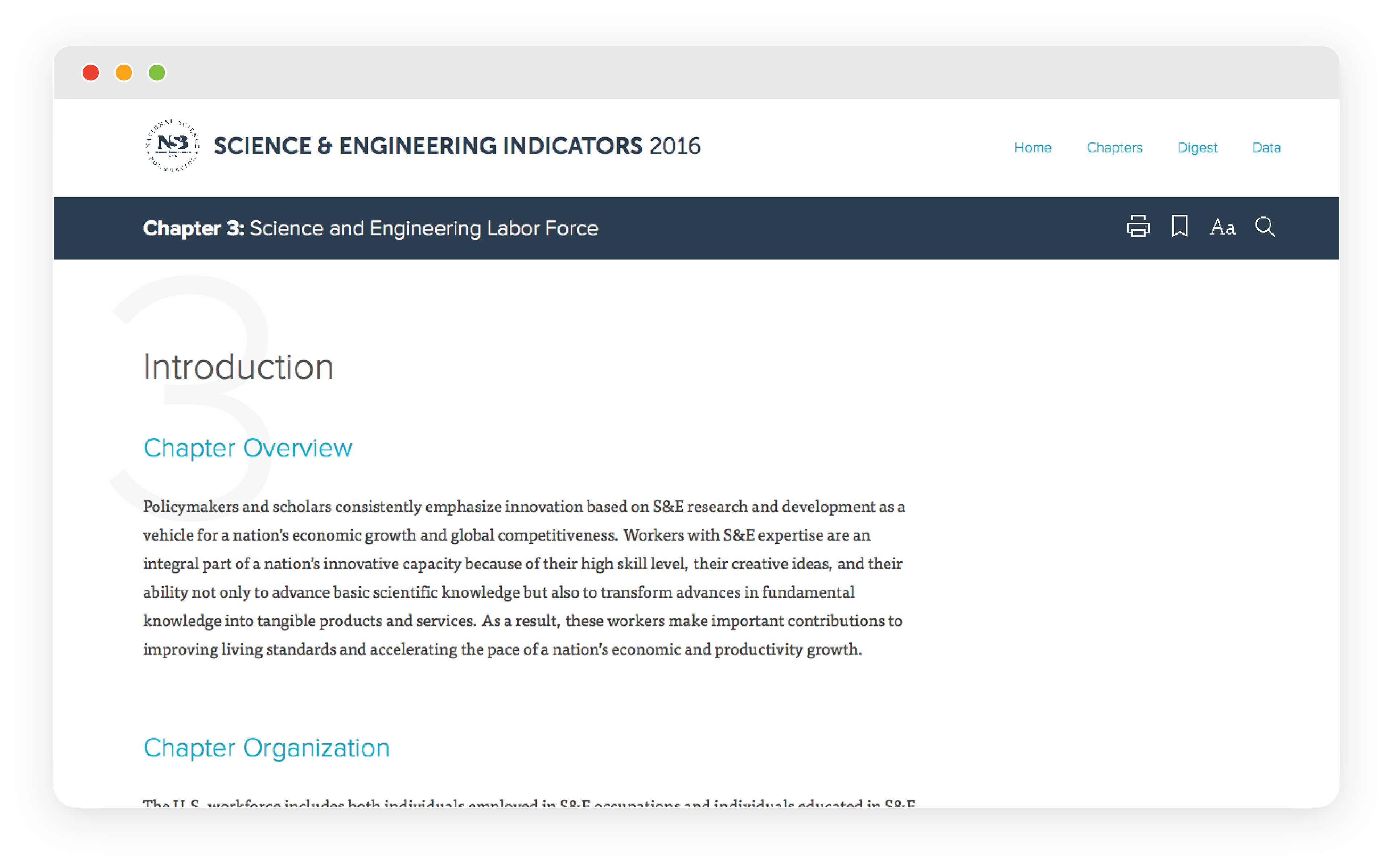
In the beginning of this project I personally wanted to innovate as much as possible with how readers could interact with the report, pushing the boundaries of what web technology had to offer. This was a mistake, and I learned a valuable lesson in user testing and rapid iteration as a result. One interesting finding during testing early ideas was that while we had the capability of being inventive, the authors were continuing to compile the report’s content in the same book-like structure. With that, the challenge became less on innovation, but rather how to translate the familiar navigation and discoverability of a book to a web browser. A few key questions I focused on as a result:
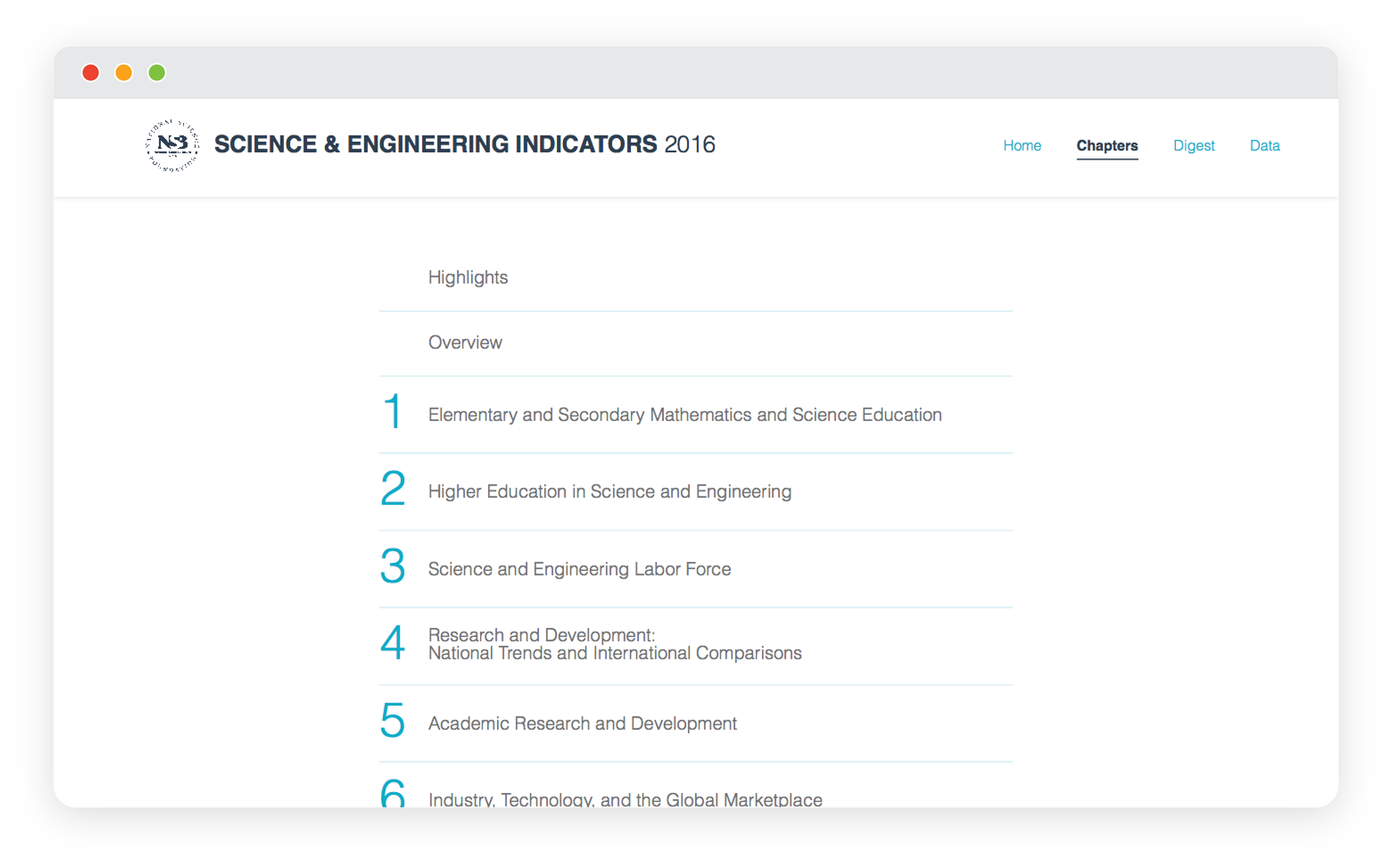
1•How do we persist the table of contents for easy navigation across the report at all times?
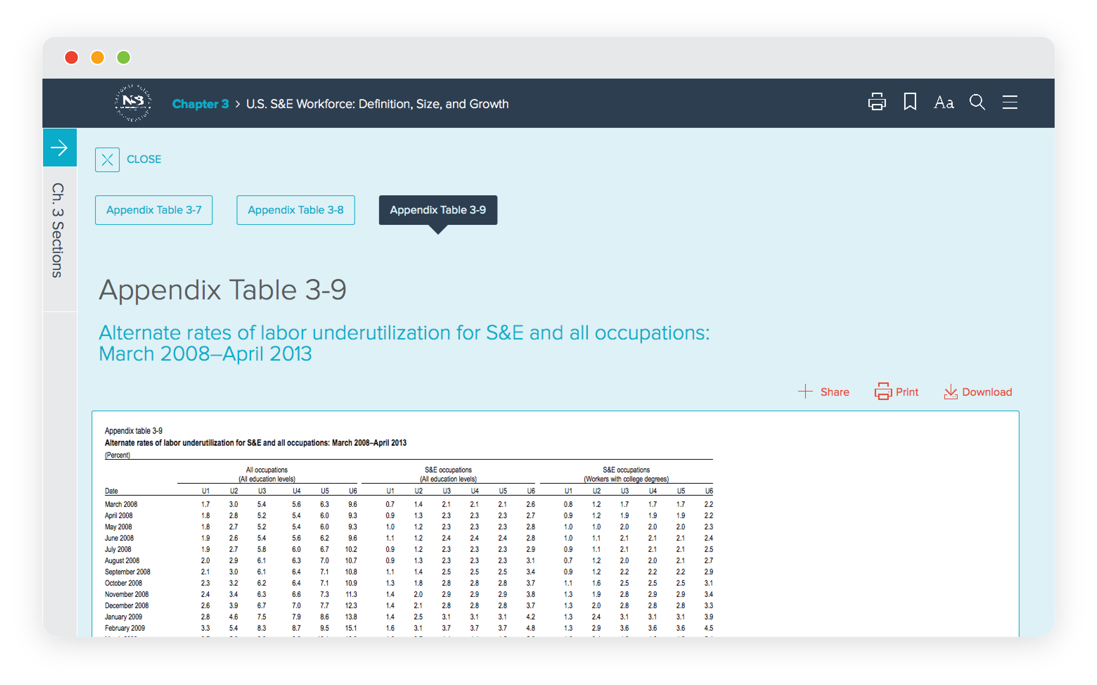
2•How do we display addenda appropriately without forcing the reader to scroll all the way up and down the page?
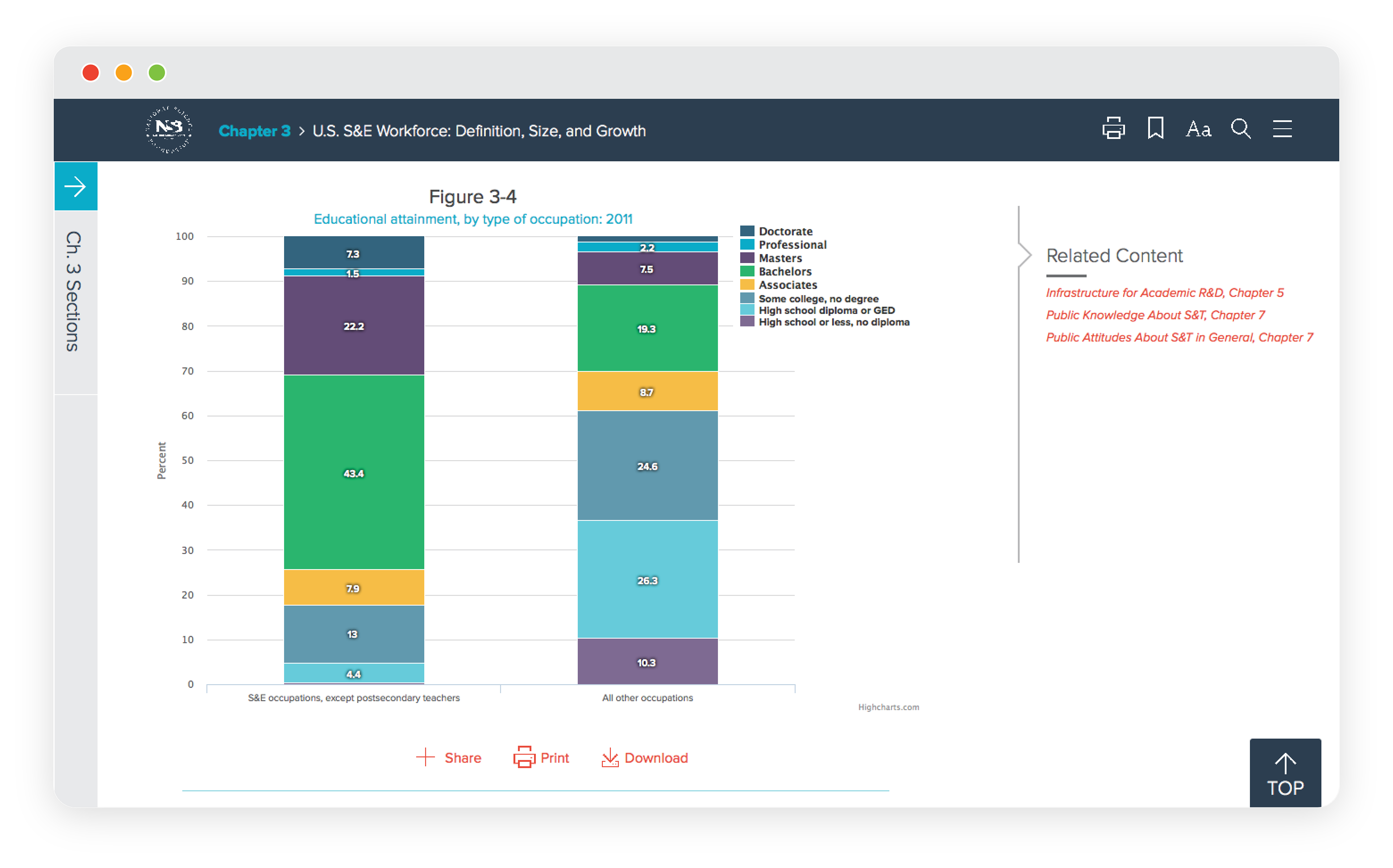
3•How do we offer contextual information (such as related reading, appendix tables, and sidebars) for those reading deeply, without distracting those who are skimming for key information?
Prototyping & Testing
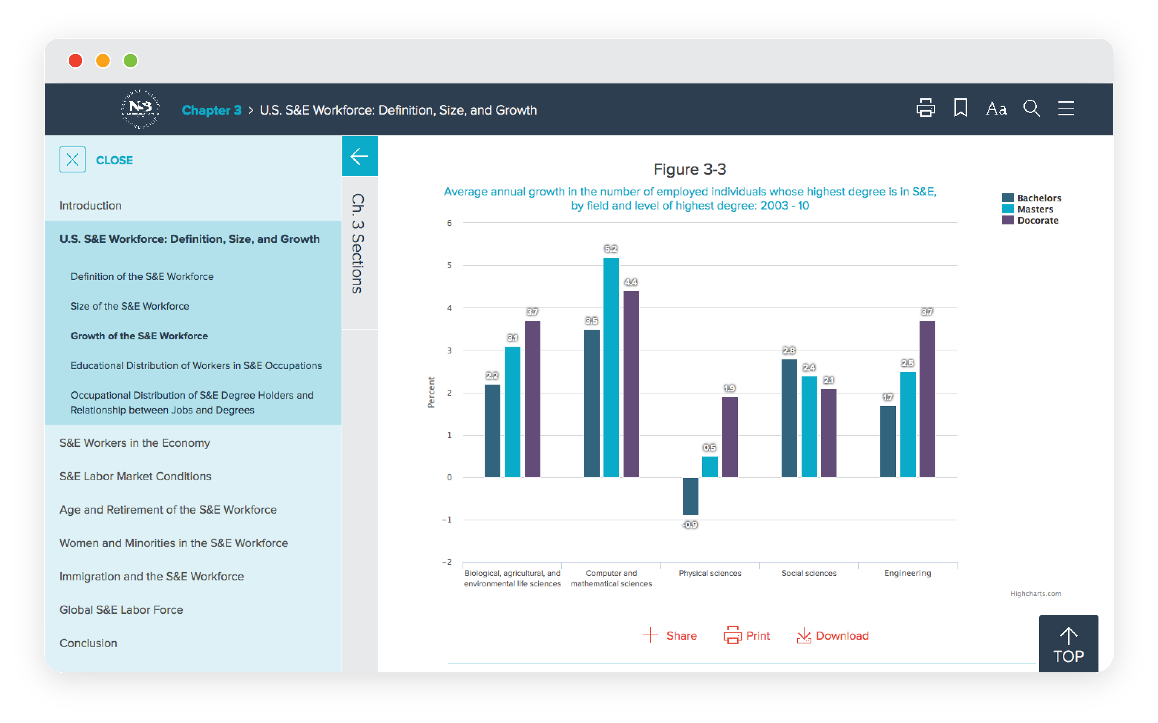
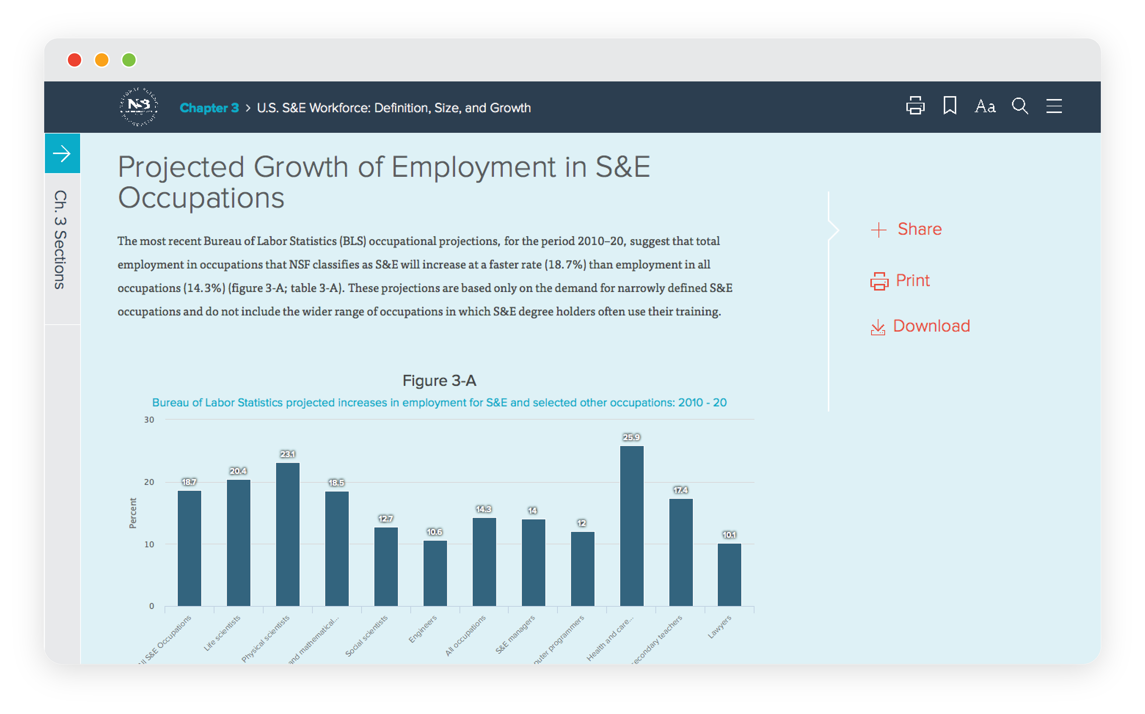
After taking the time to understand the information architecture, as well as sketching ideas around interaction design, it was time to build out our ideas and test the results. Because the timeline for this project was limited I began prototyping in UXPin but quickly moved to rapidly prototyping in code, and leveraged Highcharts for the data visualizations rather than building them from scratch.
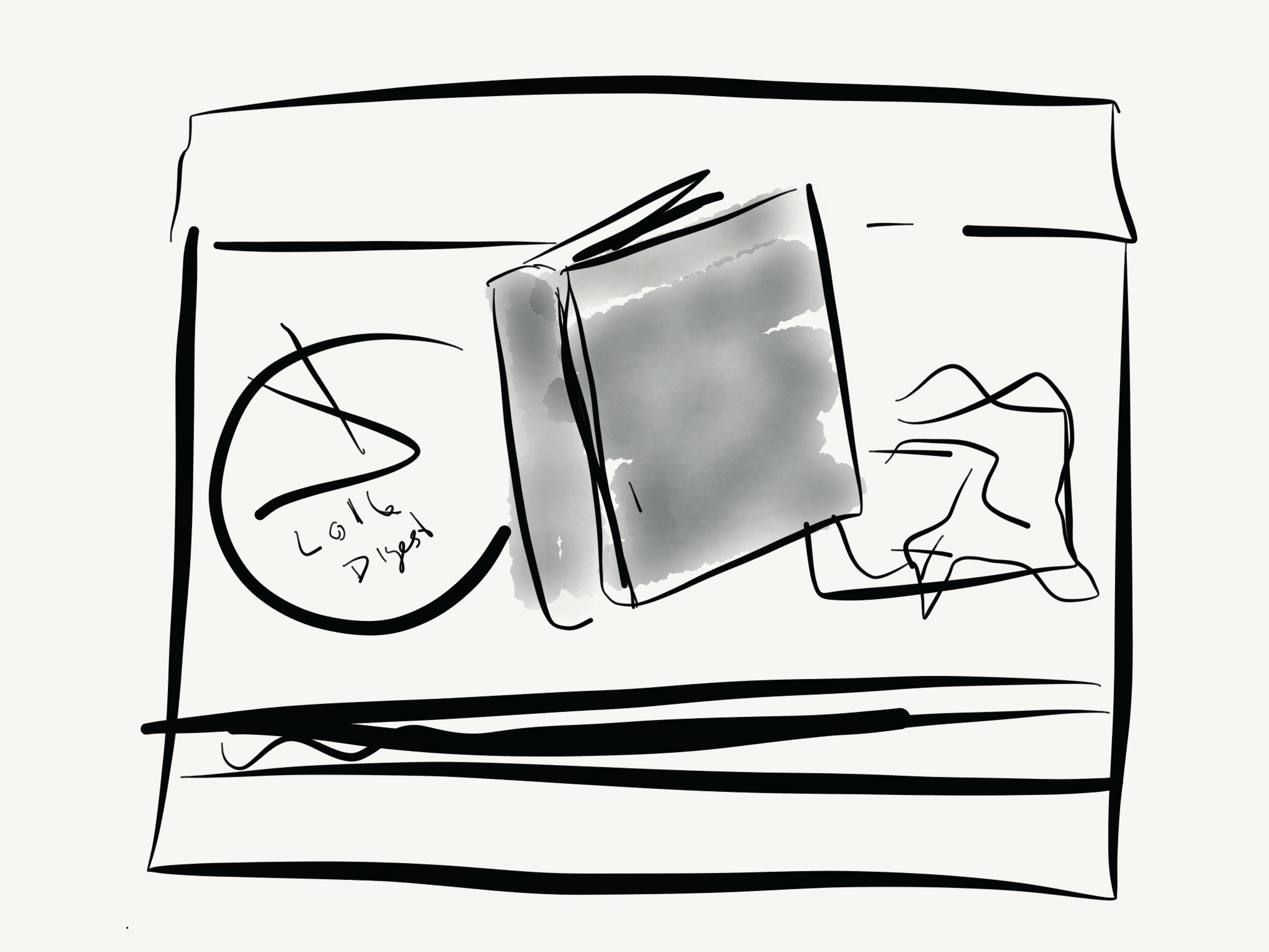
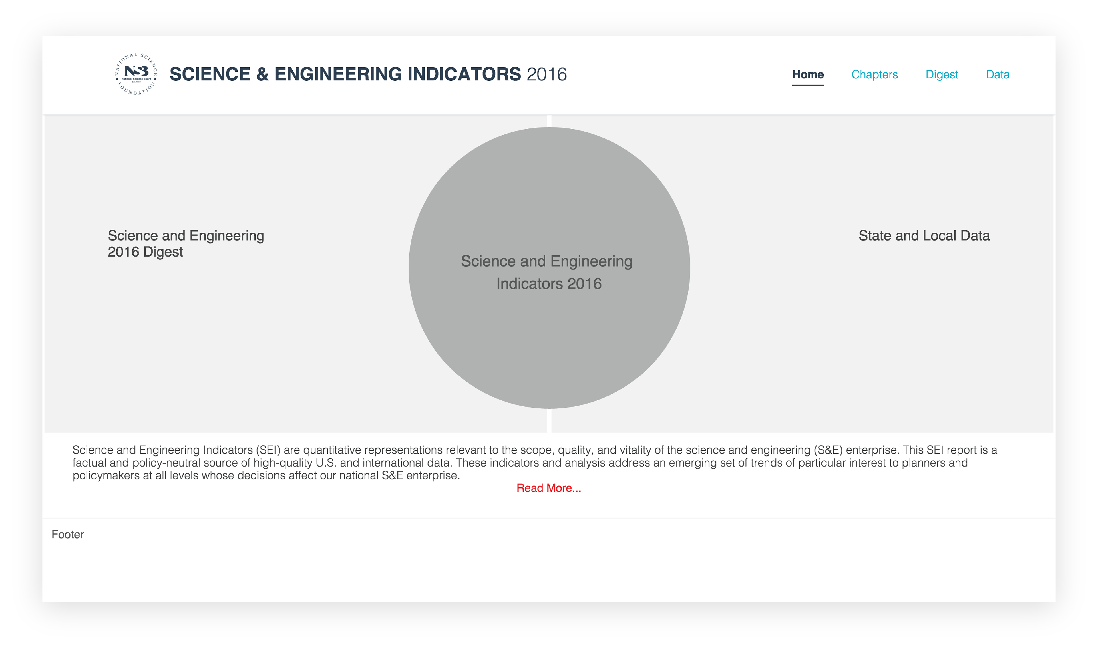
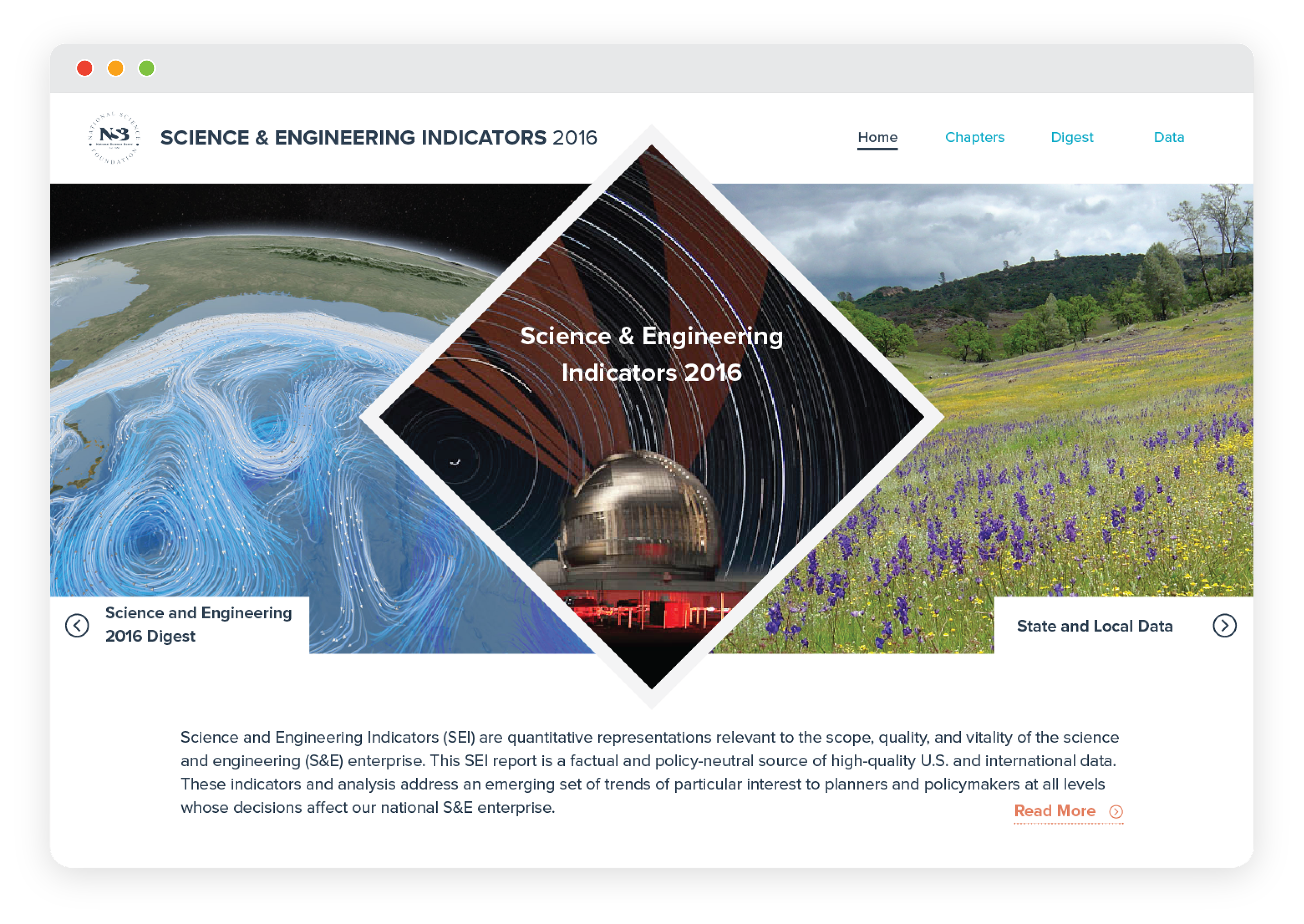
Iteration stages of the homepage. The end result used photography from the NSF media library.
Testing occurred twice a week with various members of the National Science Foundation, where the next challenge arose - accessibility. Because this was a government project 508 compliance was mandatory, but this was also my first encounter with web compliance. During this project I was able to test with someone using a screen reader to ensure the code was structured in an appropriate way, and also designed accessibility settings for adjusting font sizes and color contrast.
Outcomes
While the NSF Science & Engineering Indicators report has evolved over the years, the 2022 version still utilizes most of the layout and interaction design decisions that were made during this project for the 2016 edition to present today’s data. By utilizing a digital presentation format authoring the contents for the report also became more centralized, and editing more efficient. This was also a crucial project for me personally as it was a cornerstone in my understanding of organizing large data sets, thorough usability testing, and accessibility.
